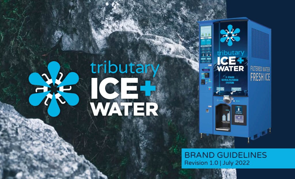
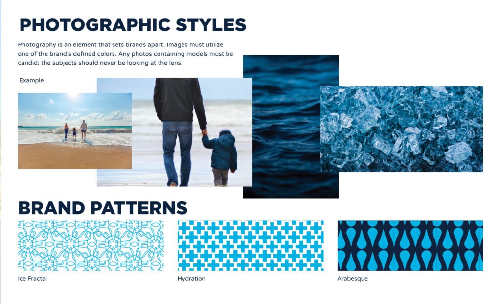
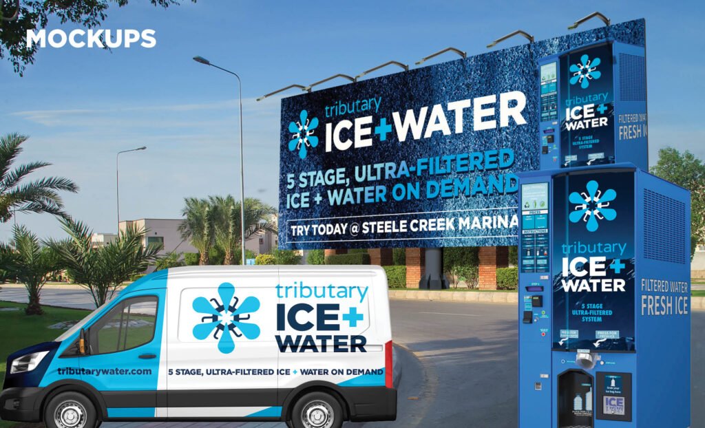
Chad Johnson had a clean concept — trusted water and ice, on demand — and a clear sense of what the business needed to feel. What he didn’t have yet was a mark that could carry that feeling everywhere the product lived: on the machine itself, wrapped around a vehicle, scaled to a billboard, and still holding its weight in a community conversation.
ScaleCraft took his parameters and built from the inside out. Before touching the mark, we started with discovery — defining who the customer actually is and what the brand needed to mean to them. That work surfaced three attributes that would anchor every design decision from there: Clean. Trusted. Responsible.
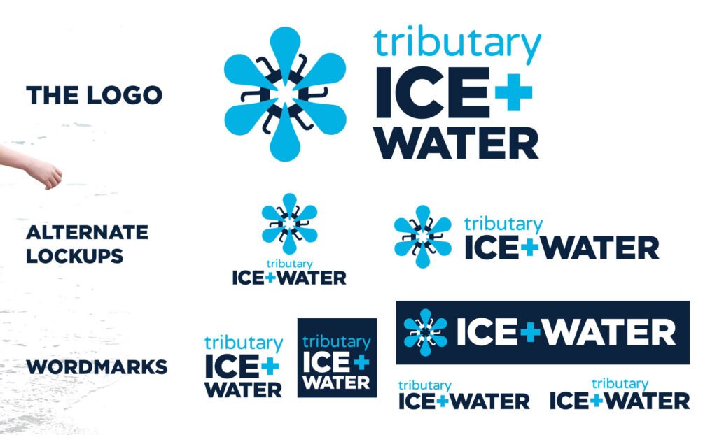
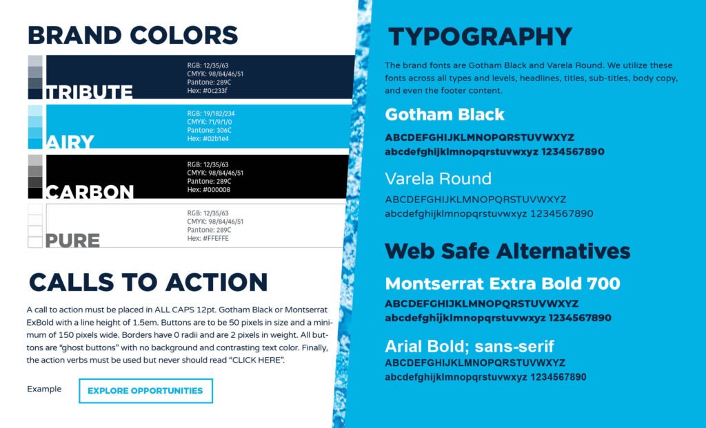
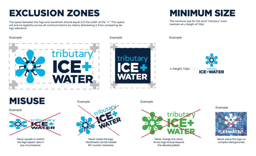
The identity system that came out of it had to work at full size and at a glance, indoors and out, alone and in motion. Every element — from the primary mark to the brand patterns — was built to that standard.